By Mariia Bublykova, Year 12
Sight is one of the five main senses a human possesses, and the one we tend to use the most in our day-to-day life. It not only helps orient us within our space and recognize objects around us, but also connects us to the world on an emotional level. This allows us to interpret the emotions behind the facial expressions of others and enabling us to cooperate and function as a society, among many other things.
However, I would like to focus on humans’ emotional response to colors in art, and how it affects the way we view the emotional coloring of art pieces.
When we discuss the emotions a certain color conveyed through art, it is important to remember that despite different interpretations there are nonetheless some universally applicable “rules” of how we generally react to a certain colour. It is also important to note that it is not always objective since human beings are not blank canvases, deprived of unique feelings and ideas. Culture, personal experiences, or current situations might change the emotional meaning people might prescribe to a certain colour. To give a few examples, the color red can be interpreted as danger and blood, or as a color of love and prosperity. White can be viewed as the color of purity or of mourning. Even though now the color pink is viewed as tender and feminine, for most of history it did not have any specific connection to femininity. In fact, until the last century, pink was considered a color fit best for boys and young men, as it was a “softer” version of red, a color traditionally viewed as masculine. Keeping in mind that the meaning of each color is subjective and might differ from one individual to another, we can take a look at what different psychological studies say.
- Red – Can be associated with love or passion, as well as anger, danger, or aggression. It is sometimes used in retail shops to create a sense of urgency and stress people to buy more product.
- Orange – Associated with creativity and enthusiasm, often used by companies with a young target audience.
- Yellow – Usually associated with happiness and optimism as in Van Gogh’s “yellow period”, but may also represent danger, like road signs. Generally evokes positive emotions, and is used largely in different domains, from fast food chains to toy stores.
- Green – Associated with nature and growth, most usually used by companies advocating for eco-friendly or sustainable lifestyles and banks.
- Blue – Associated with calm and reliability, it is the most often cited color on the planet between both genders and is the most popular color for logos. Though it may also represent sadness, or depression as in Van Gogh’s “blue period”.
- Purple – Associated with royalty, riches, spirituality, and creativity. Although there is an opinion that if exposed to in large quantities, it may negatively affect mental health.
- Pink – Associated with love, tenderness, and femininity.
- Black – Associated with strength, mystery, strictness, or reliability.
- White – Associated with lightness, purity, and modernity.
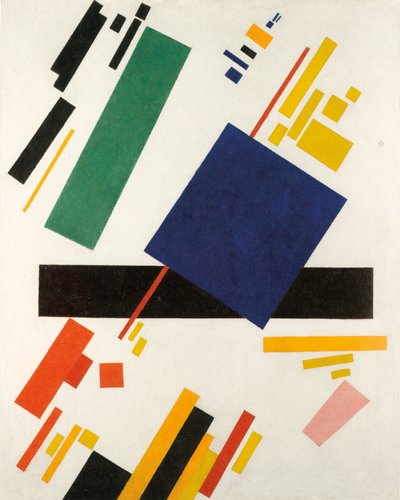
After developing an understanding of what emotions certain colors can evoke in us, we might be able to better understand and be more conscious of the coloristic choices in art. In traditional art, the object depicted is usually what holds the main theme. The main meaning of the artwork can be solely enhanced by the use of color theme. With the rise of the Impressionist art movement, we can see color taking up more and more of the spotlight in art. Today, in some styles of artwork, the meaning may be conveyed by the colours solely, or even a singular colour.
In the end, art is about making people feel, through shapes and colours they perceive with their sight. That is why, when conveying emotions in art, there may be no better instrument than color.In a way, in our minds, all emotions are colours at some level.
Further links
- https://sybaris.com.mx/psychology-color-color-impacts-feelings-art/
- https://www.wikiart.org/news/exploring-the-role-of-color-in-art-and-emotion/
- https://www.linkedin.com/pulse/psychology-color-how-use-evoke-emotion-tacpoint
- https://www.verywellmind.com/color-psychology-2795824
- https://www.crowdspring.com/blog/how-21-brands-use-colors-to-influence-customers/
- https://edition.cnn.com/2018/01/12/health/colorscope-pink-boy-girl-gender/index.html
- https://medium.com/the-collector/surprising-dark-history-when-boys-wore-pink-and-girls-wore-blue-b572e76f2f99
Images Links


