By Jiei Yamasato, Year 12
Icons Control Us

Jiei Yamasato
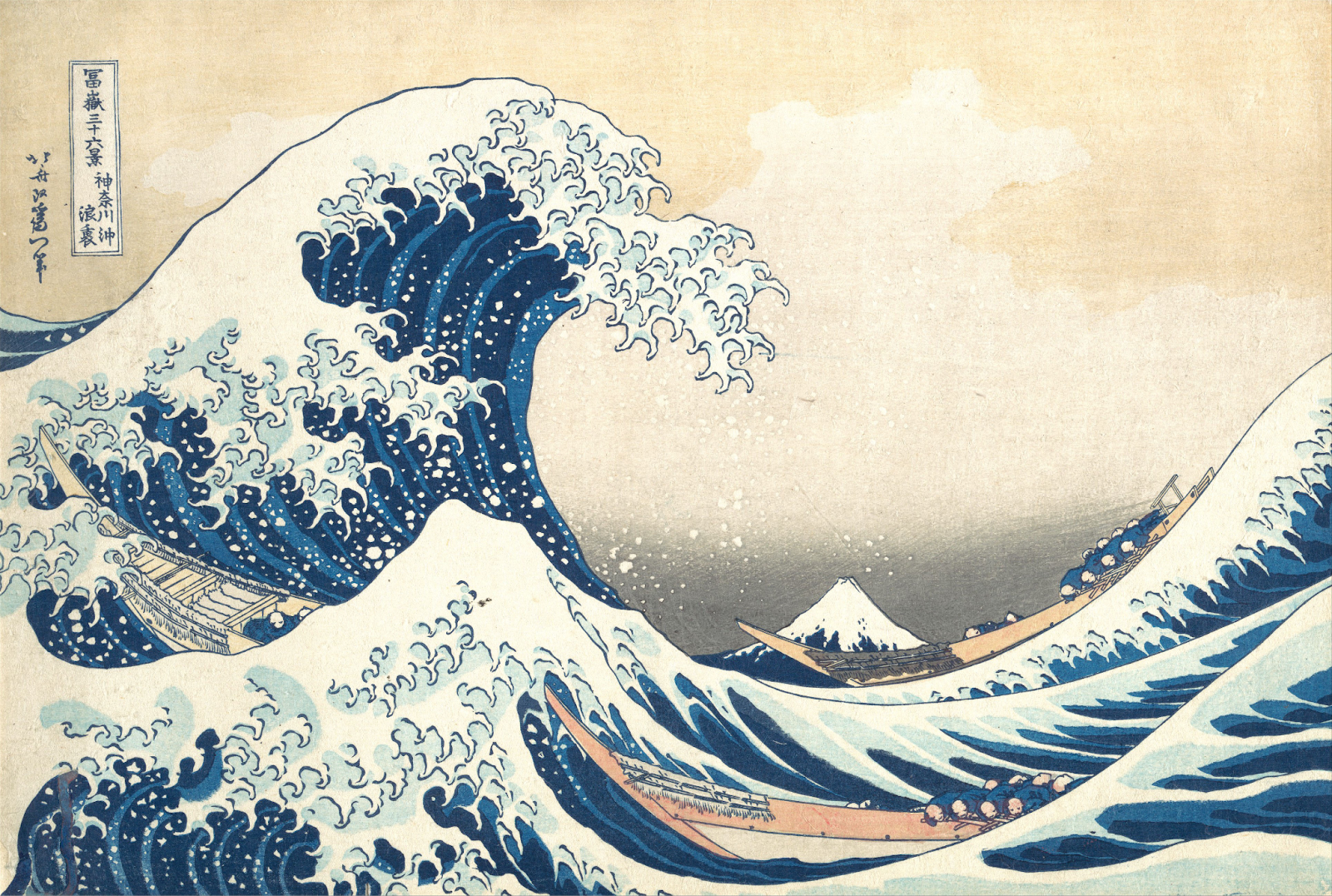
The Great Wave off Kanagawa (1831) – Hokusai Katsushika
First Encounter
Boy would I not want to be in the place of those sailors. Mother ocean’s hand curls onto the boats, crushing any hope for safe cruising. The thick blue sea water clashes and falls creating dense white bubbles. Behind all the commotion stands firmly Mt.Fuji, the tallest acme in Japan. This striking contrast of the dynamic sea and static land while at first may make Mt.Fuji seem like a beacon, until you realise that Mt.Fuji is a volcano capable of erupting any second and you’re reminded that you are never safe.
By now I suspect you my fellow reader are already bored like it’s the 7th minute of a fire drill. Hokusai’s print of a great wave is one of if not the most iconic Japanese artwork ever made. All of us have seen it a million times. But how did this specific artwork rise to such fame? And what role does the artwork play in our modern world?
It’s all about Japonism
The Great Wave off Kanagawa is the first entry to Hokusai’s series of 36 works depicting Mt.Fuji called the Thirty-six Views of Mount Fuji. Not only did it came first in the collection, but it was also vastly popular within Japan. The vibrancy of the blue used was not met by any other, and the capturing of the shape of the wave was mind-blowing considering the lack of photography in the time.
Understandably, Hokusai’s magnus opus was one of the top pics to export and to showcase to the western world later in the 19th Century, most notably at the Paris expo in 1867. At this event, artworks by various Japanese artists including Hokusai inspired Europe, starting a movement we now call Japonism. Many impressionists such as Claude Monet have left works inspired by Japanese design.

Camille Monet in Japanese Costume (1876) – Claude Monet
The spread of Hokusai’s wave would not stop at Europe however, as copies quickly spread to the rest of the world, cementing the great wave as a great icon. Nowadays, the wave has become almost a sort of cliché when it comes to waves in design. The wave has been on countless posters, commercials, and even has a LEGO set now available for the low price of 114.50 CHF.

A 1820 pcs lego set, a French commercial for the 2020 Tokyo Olympic Games, and a poster at Eaux-Vives
Like What You See
But why? Why does everyone use the same wave over and over again? Why doesn’t anyone be unique? Here my friends, is where we get into the economics and psychology of icons. Advertisements often exploit what in psychology is known as the mere exposure effect. The mere exposure effect is when the mere fact that you see something more often, you tend to prefer it. This is why people tend to dislike how they look in photos, as it is unlike their mirror image, which is what we usually see more often.
A very obvious and abundant example of the mere exposure effect is the use of logos. Companies tend to plaster their brand logo on anything and everything, whether it’s the back of your phone, the front of your car, the front page of the website, or ofcourse, at the end of each commercial. By getting consumers to see the logo over and over again, corporations slowly but surely nudge our perception of the logo, and the company it represents.

Various famous logos
Essentially, the same thing is going on with the great wave. Its great popularity meant many people saw it many times, leading many designers to parody it in their design, leading to even more people seeing the wave, leading to… I hope this article will make you notice the next time you see a great wave in the wild. Further deepening the mere exposure effect, sending you further down the spiral.
Inside LGB
If you scroll to the top of the page of this article, you may see that the “G” in “THE LGB EXPRESS” looks a bit particular. That is because the “G” has been replaced with the logo of Ecolint. Now, here’s a question: Do you like the Ecolint logo?
When you take a moment to reflect on life as a student at LGB, you may realize the surprisingly high frequency of the Ecolint logo appearing. Designed by a former student, the Ecolint logo elegantly combines the three letters E-i-G, the initials of “Ecole Internationale de Genève”. The logo is used in all sorts of places, in emails, on tokens, on big flags at assemblies, and of course on school newspaper logos too.

A school assembly, a weekly newsletter, and some kermesse tokens (ancient artefact)
By seeing the Ecolint symbol over and over again, we appreciate it and the peace it represents more and more, together as a community. We gather under the unifying symbol every once in a while to appreciate our school and our lives. This is the power of icons.
Extra Information
Hokusai Katsushika (1760-1849) is a Japanese artist of the Edo period, which took place from 1603 to 1867. During this era, Japan was at peace for over 200 years, allowing for culture such as art, theatre, and poetry to progress and evolve. Many of Hokusai’s works are known to be ukiyo-e(art for the common) and were made into woodblock prints to be mass produced and sold for the modern equivalent of about 4 CHF.
It is said that Hokusai was always changing, as he had at least 30 different aliases he went by across his life, and moved residence 93 times. Perhaps his dynamic life style is what lead to his dynamic landscapes.